Sparta science
Groups: Putting Data in Context
Giving organizations a clearer view of their people's performance.
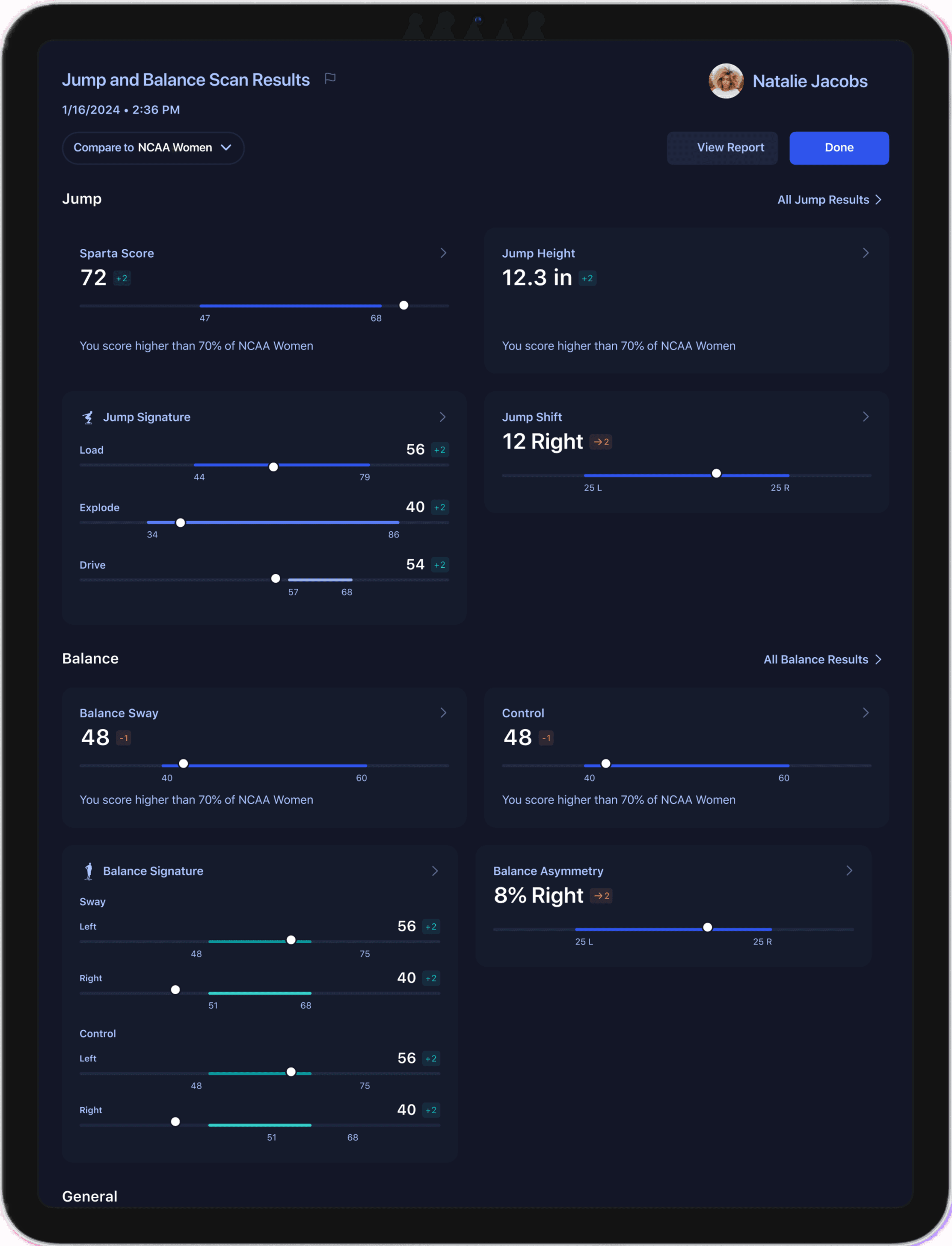
A dashboard screen showing an individual's performance.
Making Comparisons That Matter
Sparta Science is a platform that helps organizations like physical therapy centers, sports teams, and the US military understand the connection between health and movement. Some of Sparta’s clients needed a clearer way to compare individuals within similar groups rather than against the entire, diverse dataset. For instance, comparing a college athlete to a senior in physical therapy didn’t yield meaningful insights. The new Groups feature—designed for iPad and macOS—allows users to categorize people with similar characteristics, such as age, sports position, or occupation, providing more relevant performance comparisons.
Understanding the Need for Grouped Comparisons
Major clients like the US Military and professional sports teams wanted to measure performance in a context that made sense. By grouping individuals with similar characteristics, they could gain precise insights into performance. Sparta’s data scientists began categorizing user data based on characteristics such as age, weight, height, sports position, occupation, and injury history. This enabled groups to form within the dataset for more meaningful and relevant comparisons.
Due to privacy policies like HIPAA, however, I couldn’t gather direct user feedback. Instead, I collaborated with sales and customer success teams to interpret feedback from organization administrators and refine design requirements.
Our key objectives were to:
Enable performance comparisons both within specific groups and against a global population in the UI.
Create an intuitive way to switch between views without clutter or confusion.
Ensure that group comparisons were easy to interpret, providing meaningful context for performance metrics.
Designing Contextual Comparisons for Diverse User Groups
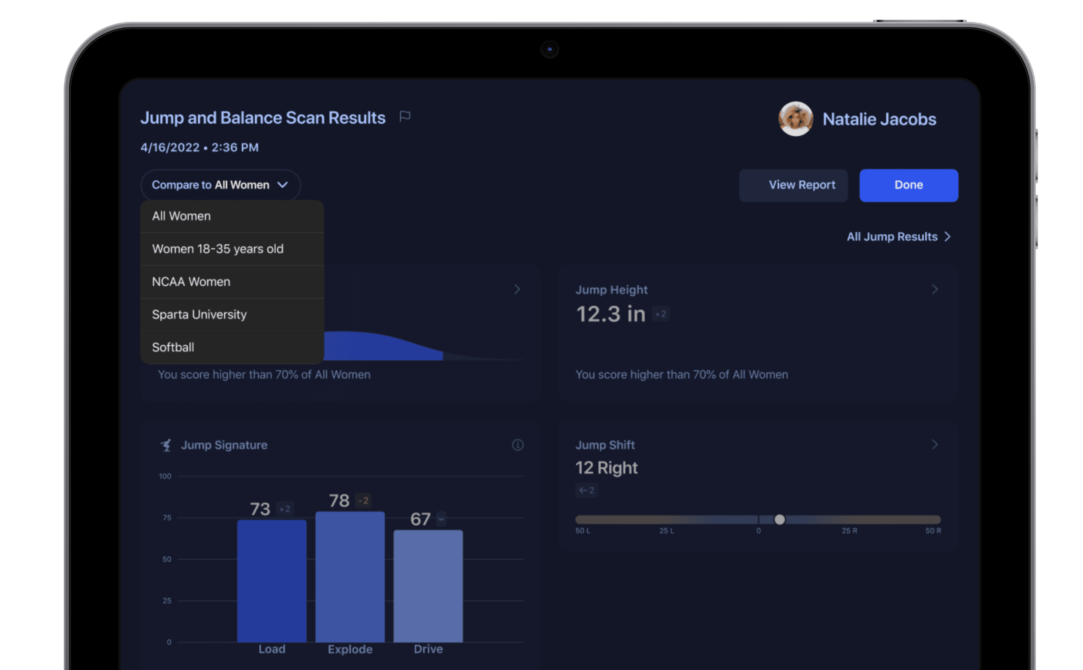
To create a seamless way for users to switch between different comparisons, I began by modifying an existing dashboard to add a dropdown menu. Early designs used familiar elements like bell curves, bar charts, and line graphs on the dashboard; however, user testing on UserBob.com showed that users found these formats confusing. They struggled with understanding score changes, interpreting metadata, and reading bell curves. Based on this feedback, I collaborated with stakeholders and iterated on the designs to create new components that met user needs.
A new dropdown menu allowed users to change group comparisons.
Creating a User-Friendly Dashboard for Group-Based Insights
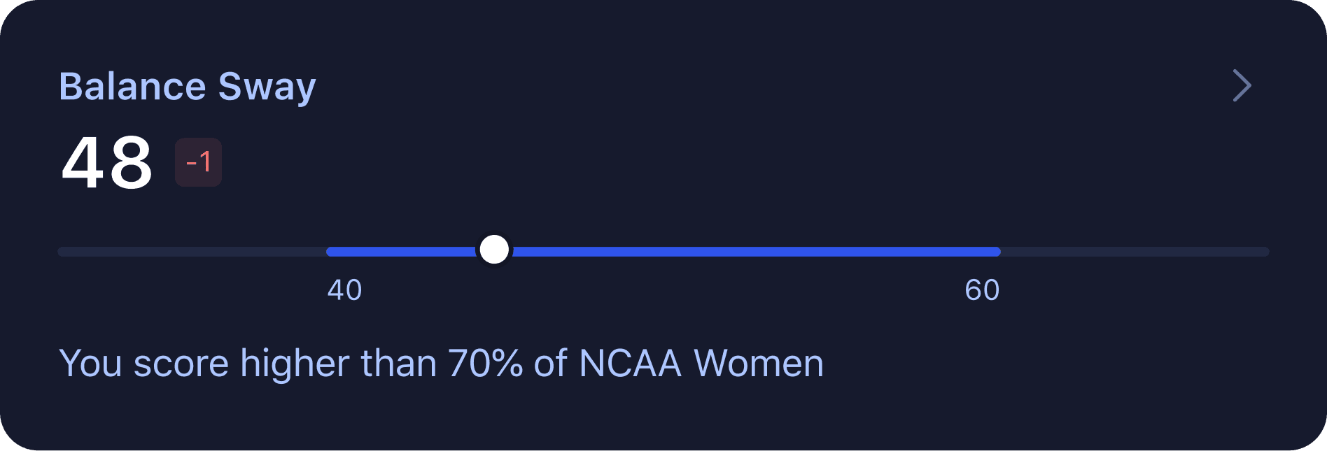
Through several design iterations and close collaboration with the data science team, I introduced a modified box and whisker plot that contextualized individual scores against both group and global populations. This solution provided clear, relevant comparisons without compromising data integrity.
The final design included three main components:
A light background line representing the entire Sparta Science dataset, scaled from 0 to 100.
A blue line highlighting the distribution within the specific group (e.g., collegiate women’s basketball players).
A white circle indicating the user’s actual score, such as Balance Sway.
Beta clients responded positively, and follow-up testing showed that the design increased clarity and comprehension. To ensure accessibility, I prioritized color contrast and screen reader compatibility. The success of this feature has sparked discussions about making these components the standard in Sparta’s default interface.
The new data visualization displayed an individual's performance to a specific group and the entire population.
For more details, read about this feature on the Sparta Science blog.


